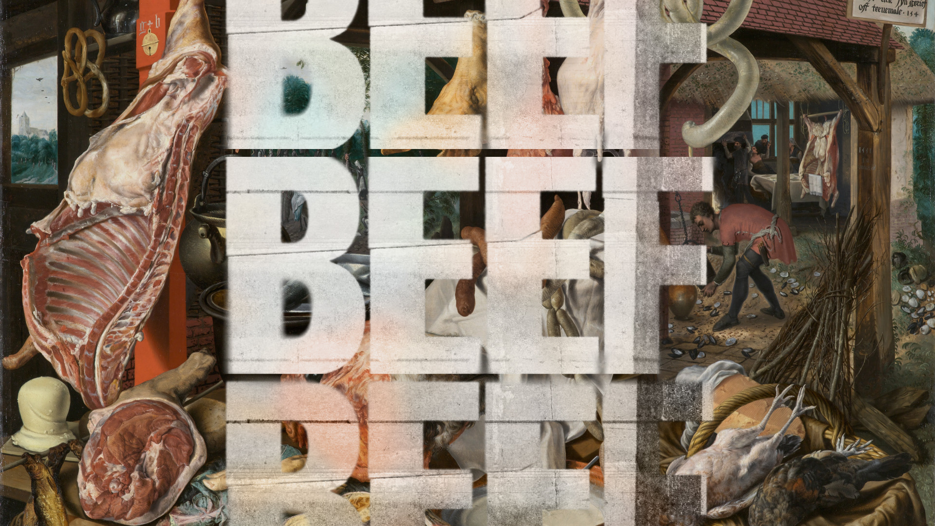
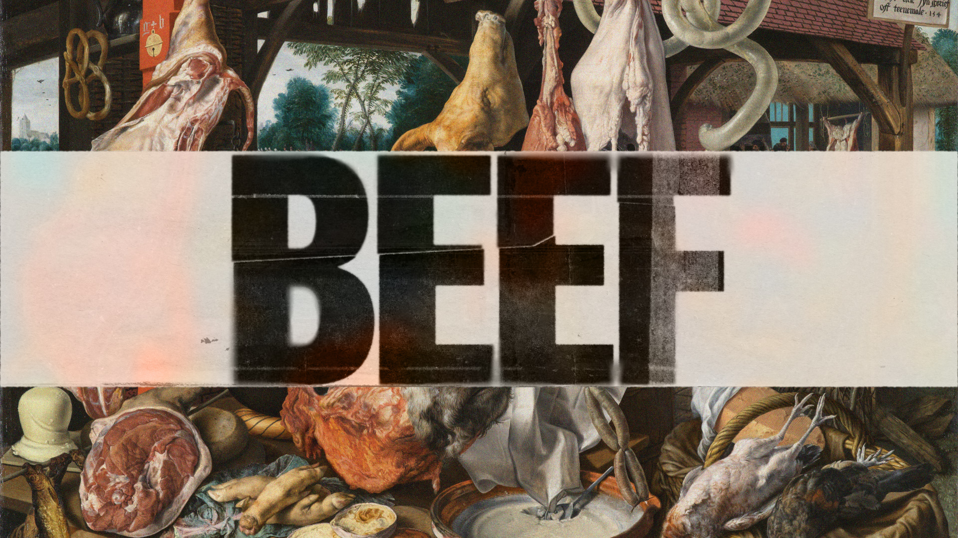
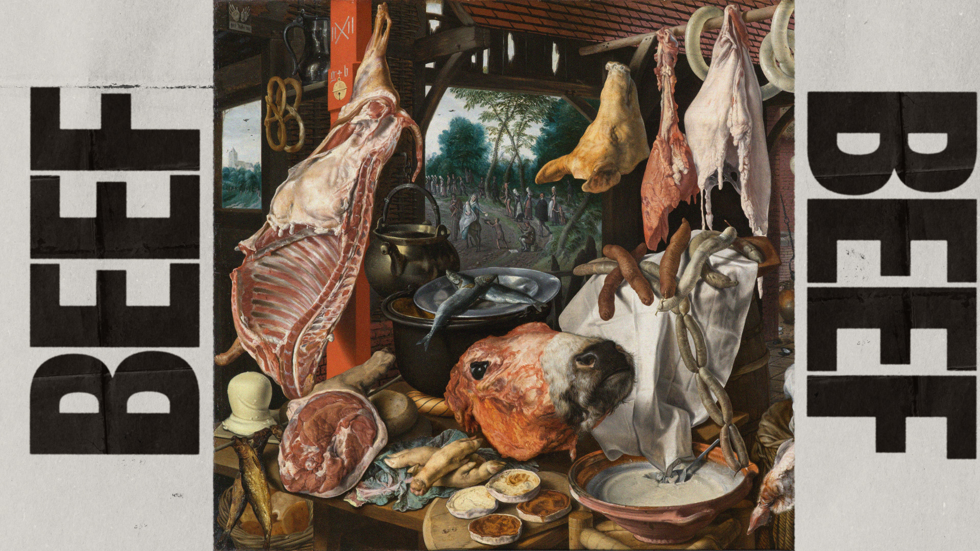
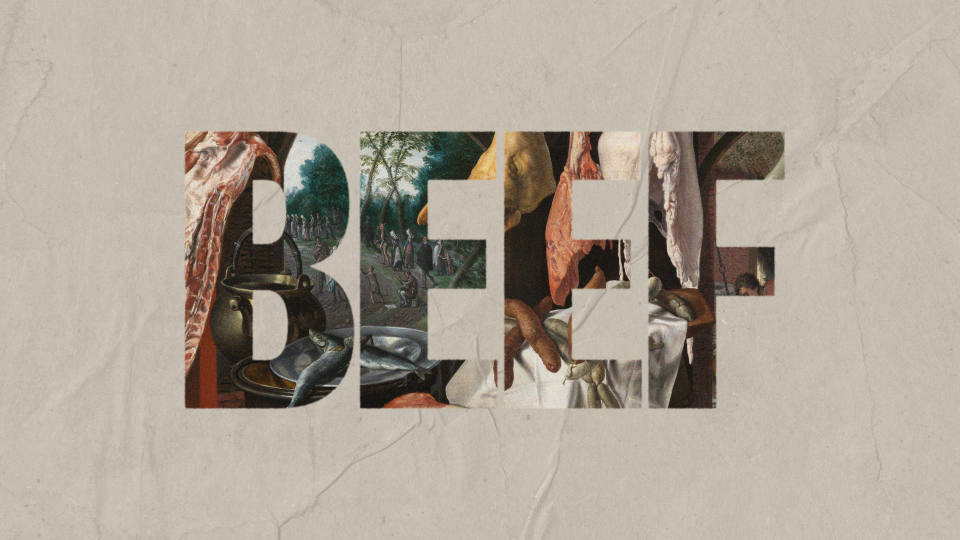
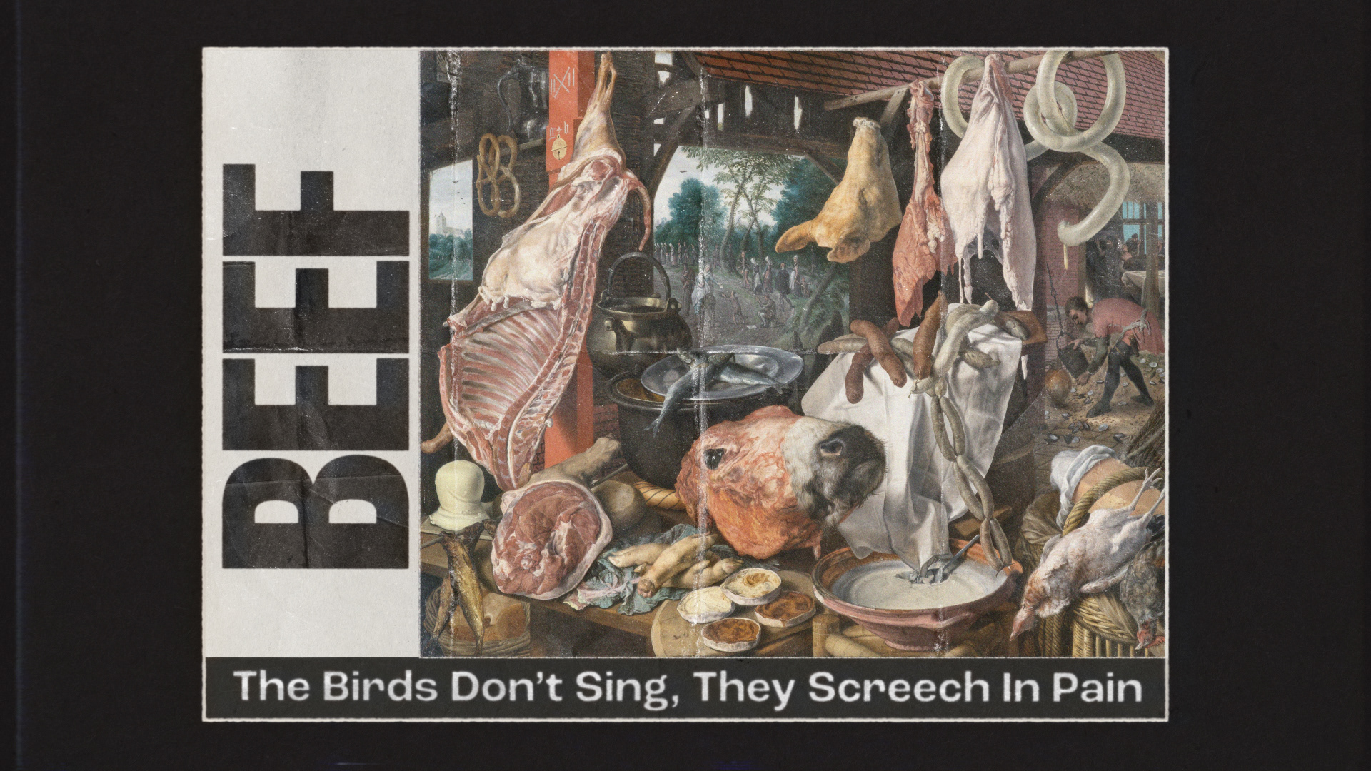
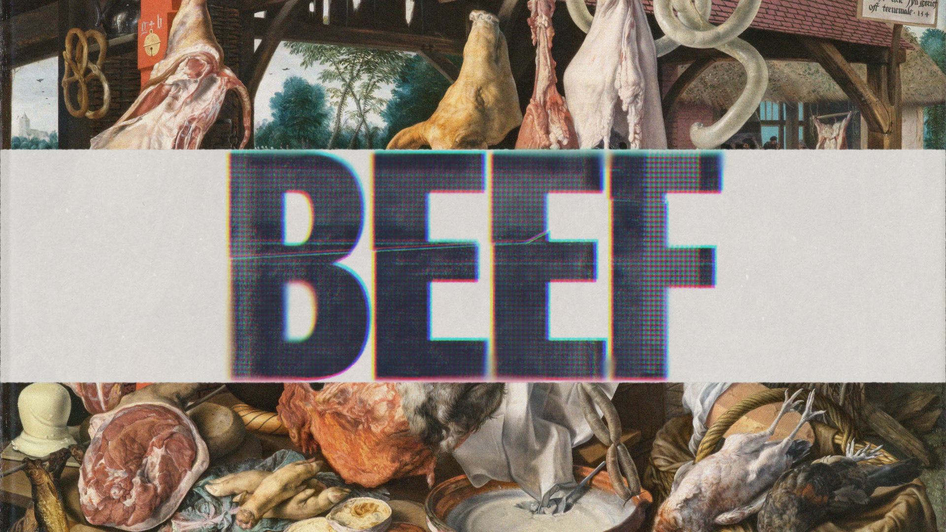
Working for Sarofsky is always a great experience and this particular project was exceptionally enjoyable. I joined the team of designers early in the development phase to craft titles for a new Netflix series. Our task was to delve into distressed typographic treatments reminiscent of an edgy 90s style, drawing inspiration from the likes of Chris Ashworth and David Carson. Those elements would then be set on provided paintings. I devised multiple treatments ensuring the flexibility to switch fonts while preserving the distressed treatment. Several of my treatments were selected for the final episode titles, notably Episodes 4, 5, and 9. Below are some initial explorations. There is a comprehensive breakdown of the project on Sarofsky’s website.